
out yonder
digital abstract painting
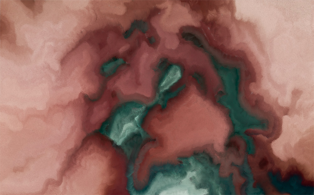
Yet another attempt at recreating a watercolor effect. I think on that basis, this qualifies as an epic fail. It looks, to me anyway, more like acrylic or oil. I added in some embossed effects - to accentuate some of the brush strokes - which ended up making the "paint" look even thicker (noticeable in some areas if you zoom in enough). Not the direction I had intended. I need start again from scratch. To me, watercolors typically (though not always) have a much more ethereal look, often with noticeable artifacts left over from the evaporation of water, and pooling & bleeding of pigments.
72in x 116in @ 150ppi;
big & zoomy: http://mattlindley.info/post/2012/11/17/out-yonder.aspx
72in x 116in @ 150ppi;
big & zoomy: http://mattlindley.info/post/2012/11/17/out-yonder.aspx
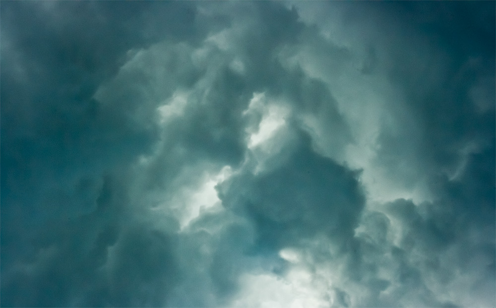
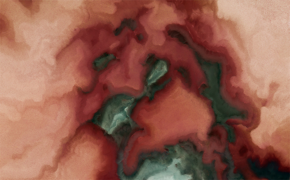
This was my starting point - my inspiration, if you will. I caught this earlier this summer right before a big storm.
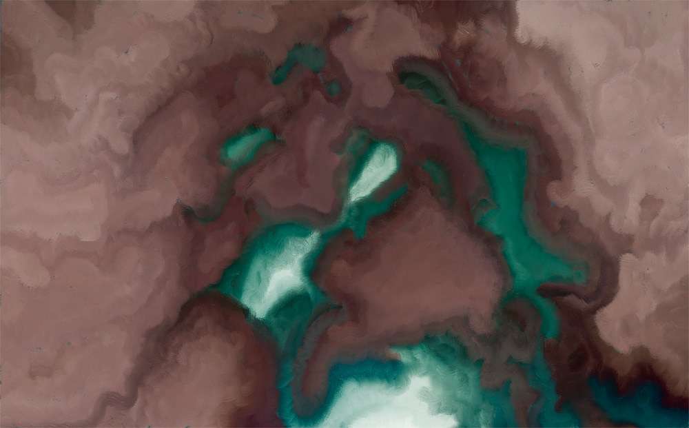
Next was laying in the big blocks of color.
The bristle brushes work more slowly - at least on my antique of a computer - but do provide a really nice texture.
Adding in more detail and adjusting the overall colors a bit.
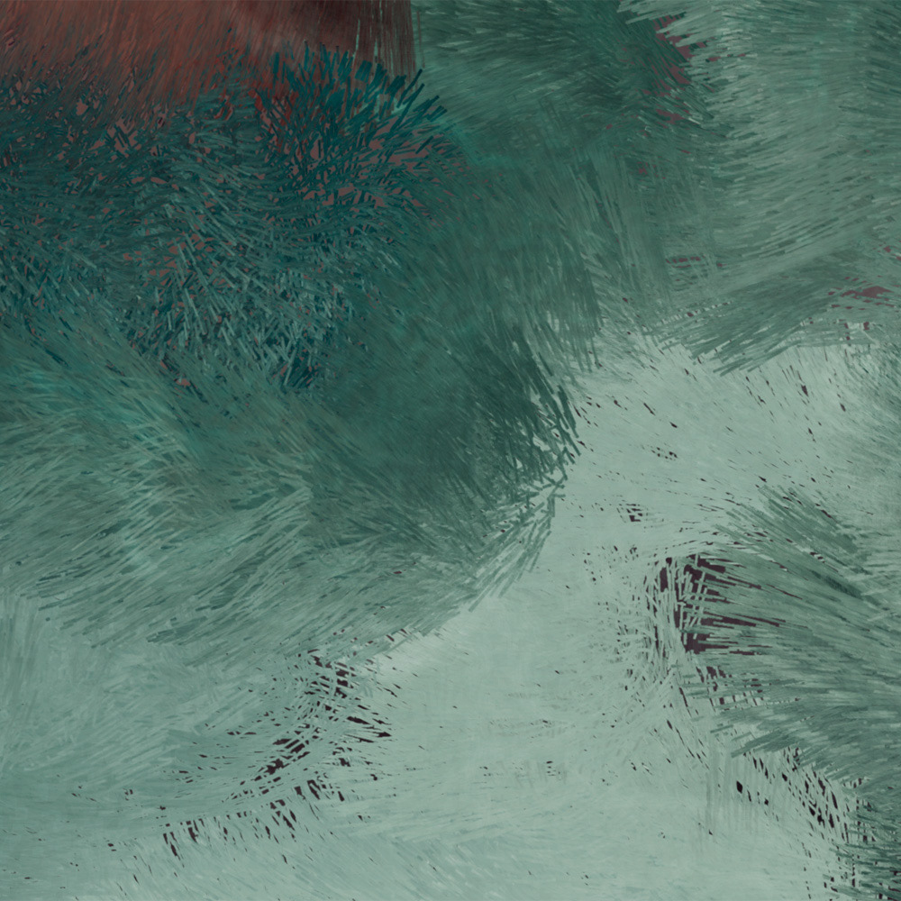

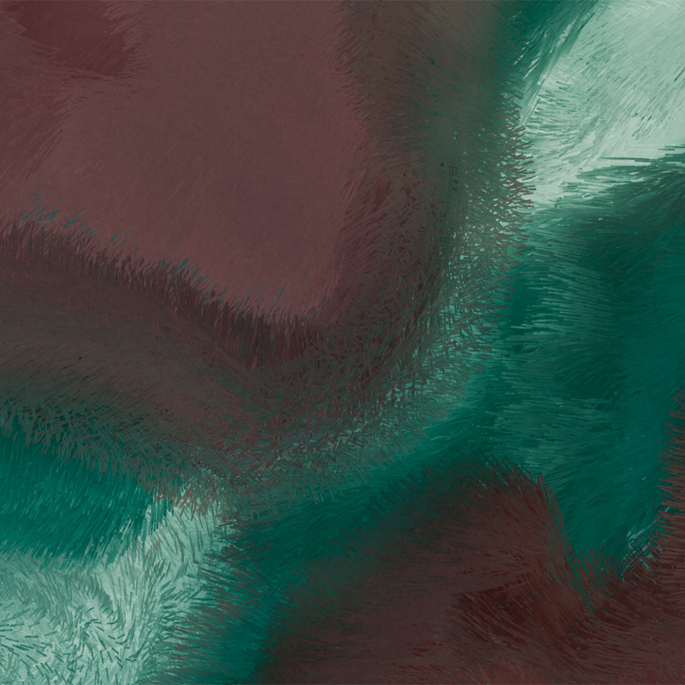
Here you can see where I added depth to the brush strokes. I like it because it gives it a more realistic look.
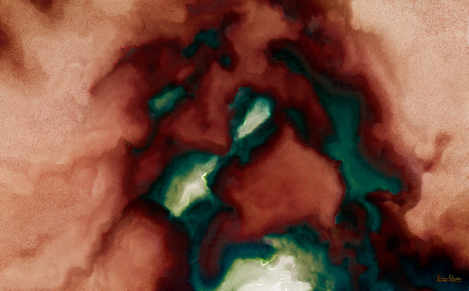
This is where I ended up. Not the watercolor I was shooting for, but not completely crappy, either.