
ascension of man series
My series of paintings incorporating typography - text taken from various sources for each piece.
ascension of man
art and typography
art and typography
This series of paintings began as a quick piece playing with typography blended in with a simple painting. I enjoyed the end result so much I decided to continue with another, using a different set of words. By the time I stopped, I had completed 6 paintings in the series.
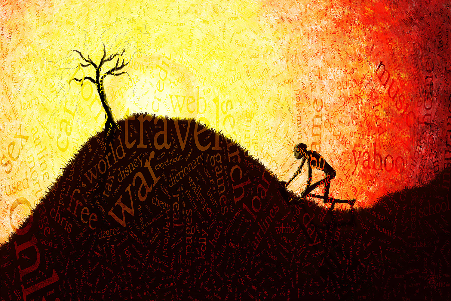
Part 1 was the most spontaneous of the series. I got a random idea to create a typographical piece with some relevance to the moment, to the world and what was on the minds of people everywhere. Of course, one of the easiest ways to tap into that is to get a report of current search terms being used online. Well, it's easy if you're willing to pay for it. Me? I'm cheap; so, I had to do a bit of manual research, from multiple sources. I ended up using wordle.net for the text layout. It's free and easy. When I was finished, I realized that I had tapped into something that I needed to explore further. Within an hour of posting the piece, I was already thinking about what I could do next.
36"x24" @ 240 ppi. View full size: http://mattlindley.info/collections/abstracts/ascensionofman.aspx
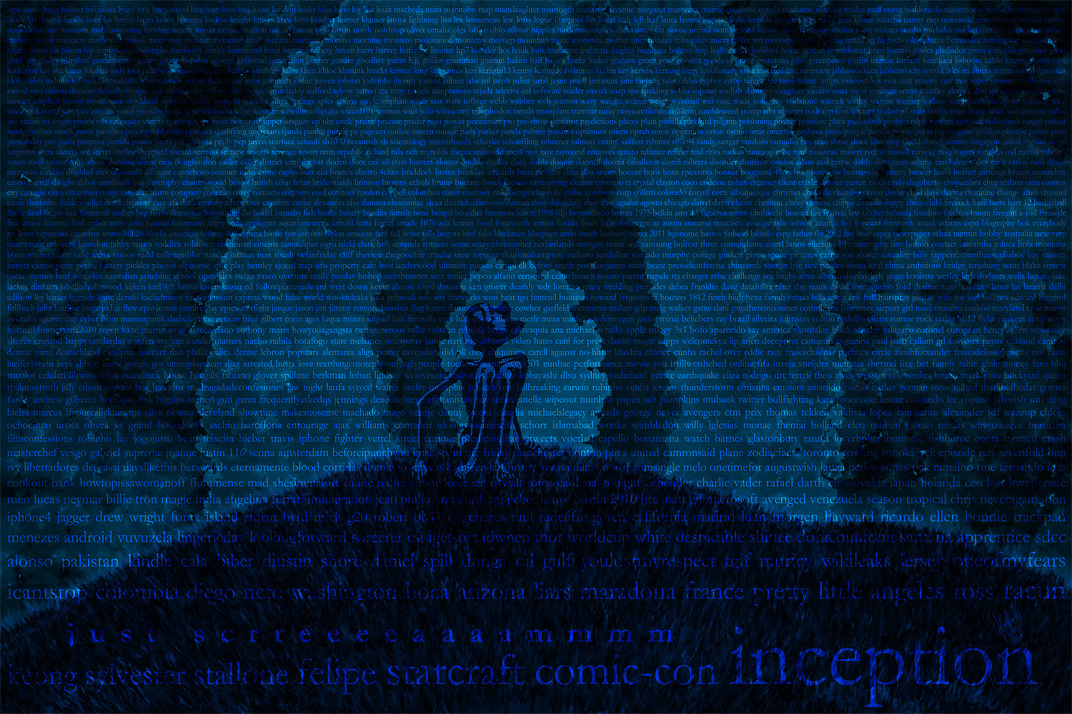
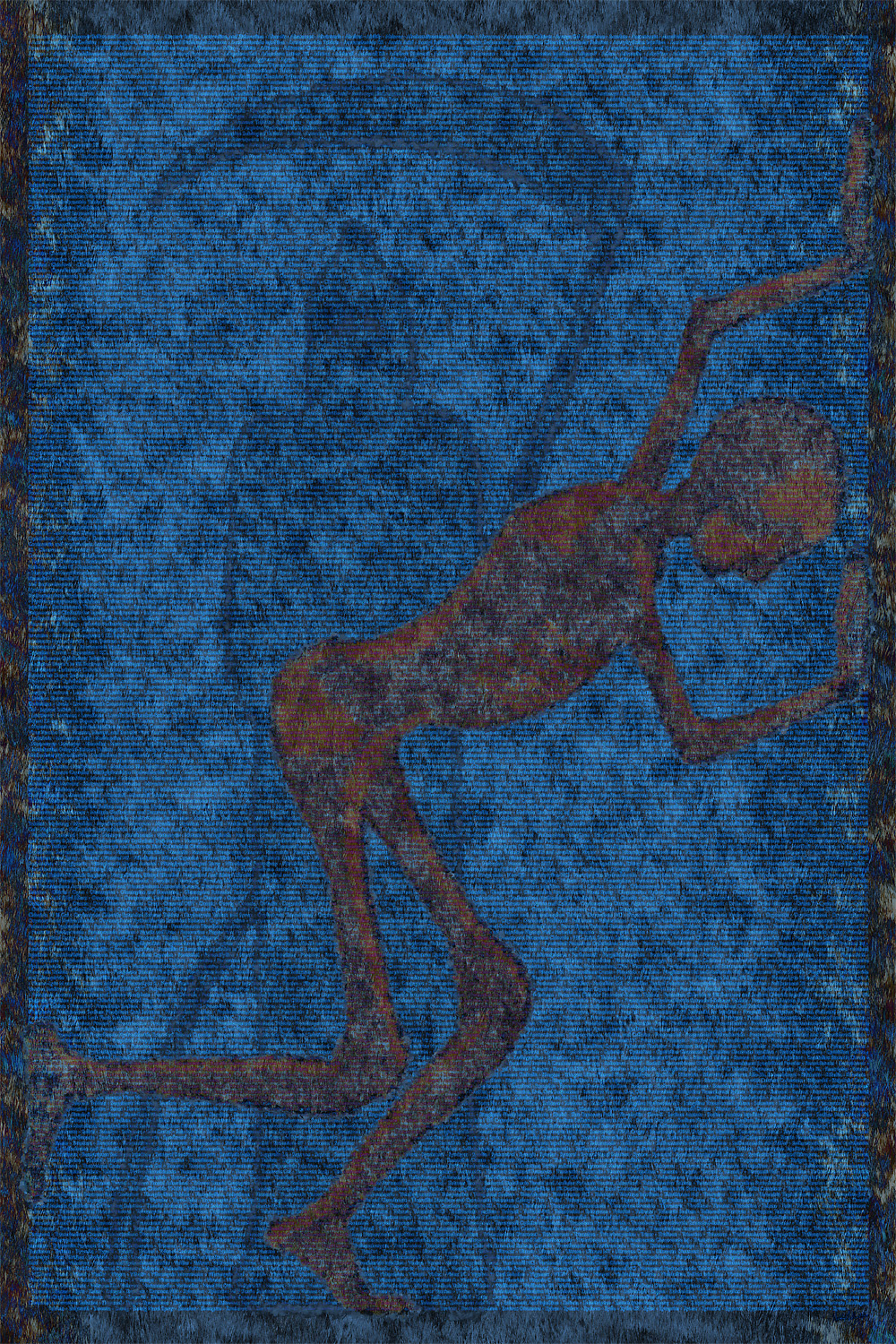
Part 2 is my least favorite. I think I was trying too hard to recapture the elements that I liked from the first piece. I combined a month of top Twitter trends with a month of top Google Trends. Both services offer up this information, though the process of collecting it was a pain. There are so many problems here... I should have used a much larger time span. Actually, I should have chosen a different topic completely. I do like a dark, monochromatic theme. I'm not crazy about the howling man or the hill. The whole thing is just a bit lazy. Nuf said about that.
36"x24" @ 240ppi. View full size: http://mattlindley.info/collections/abstracts/ascensionofmanpart2.aspx

For part 3, I got my butt in gear and went at it full steam. So, I chose a topic that I think about from time to time. Religion. The duality and duplicity of organized religions, to be more precise. It has always struck me that every religion is awash in hypocrisy. Well, every religion I've had the opportunity to observe, anyway. I'm also amazed a the extensive varieties of beliefs there are out there, even today. So came this piece, pulling these threads together.
72" x 48" @ 240ppi. View full size: http://mattlindley.info/collections/abstracts/ascensionofmanpart3.aspx
Part 4 is about pharmaceutical drugs. Those we ingest and those we put on our skin. I'm not the biggest fan of medicine. Not because I don't believe in them, I do. I just don't think that we need to pop a pill every time we feel a tickle in our nose or an ache in our temples. If you rely on pills to make you feel good, then you're always playing catch up. I'm astonished at the chemicals we use in and on our bodies. So, I researched drugs and came up with about 4,300. Yeah, 4,300 different things that we put in our bodies, as a society. This is my favorite piece of the series. I love the imagery, the simple approach to presenting the text, the colors, the composition. Of all the pieces, this one works the best to me. Follow the link to see this one full size. The text is too small to see in this reduced version.
48"x72" @ 240ppi. View full size: http://mattlindley.info/collections/abstracts/ascensionofmanpart4.aspx

If Part 4 is about the chemicals we use to feel better or look better, then it seemed logical that Part 5 should be about the chemicals that make us feel bad and look worse. Yes, this one is about the crap we put in our food. This piece is the most disturbing. The research was miserable. Not just because it was difficult, but because of what I learned. If you only knew what you are feeding your children! Now, I will admit that my research is not the most scientific. There could be errors in my data. However, knowing corporate America for what it is, I can see this crap going into our foods.
Disturbed by the research, I wanted to put it into a painting that expressed my feelings appropriately. This wasn't some nameless entity doing horrible things to us. The culprit here is us. From there, the design was relatively easy to complete.
Disturbed by the research, I wanted to put it into a painting that expressed my feelings appropriately. This wasn't some nameless entity doing horrible things to us. The culprit here is us. From there, the design was relatively easy to complete.
72" x 48" @ 240ppi. View full size: http://mattlindley.info/collections/abstracts/ascensionofmanpart5.aspx

Part 6 was back to duality. I don't remember why/how I decided to choose this subject - I could kick myself for not making a note of that. For this one, I researched the phrases "I love you" and "I hate you" in as many languages as I could find. Yes, there could very well be mistakes in these translations. I only speak 3 languages, and only one of those well. For the rest, I had to rely on the good people of the internet and the online translation services.
That aside, this appealed to me as a simple, elegant theme. I decided to keep the painting part of this piece as simple and to the point. So, I placed the two skeletons, one black, one white. The colors are not about race, but about the two sides of the phrases "I Love You/I Hate You." I wanted there to be a bit of ambiguity, so I left skeletons, rather than turn them into people with genders and facial expressions. I wanted the viewer to make their own conclusions about gender and whether the couple is loving or fighting.
That aside, this appealed to me as a simple, elegant theme. I decided to keep the painting part of this piece as simple and to the point. So, I placed the two skeletons, one black, one white. The colors are not about race, but about the two sides of the phrases "I Love You/I Hate You." I wanted there to be a bit of ambiguity, so I left skeletons, rather than turn them into people with genders and facial expressions. I wanted the viewer to make their own conclusions about gender and whether the couple is loving or fighting.
48" x 72" @ 240ppi. View full size: http://mattlindley.info/collections/abstracts/ascensionofmanpart6.aspx
This was the last piece of the series - not because I decided I was finished, but because I was out of ideas. I was having a difficult time coming up with the next concept. I would very much like to continue with this series, or something like it.
So, if you have any ideas, please let me know.
So, if you have any ideas, please let me know.
You may also like
denimpop
August 31, 2012
Blender Rendered Abstracts
February 02, 2013
The Hands
January 12, 2013
benediction
June 23, 2013
monsters from the k·id
September 07, 2012
Tree
May 16, 2014
Robin
April 17, 2017
Swarm - Illustration Friday
February 28, 2011
Hell Freezes Over
February 05, 2011
Weathered and Without
May 18, 2017